Neutrals have forever been a staple in home décor, and they are continuing to see a greater rise in popularity as one of this year’s color trends in design. Natural textures and colors being popularized by designers and Instagram influencers alike. The ease and simplicity of neutral decor has proven that it’s here to stay.
With earthy tones and nature-inspired colors and fabrics making a big impact, it stands to reason that both warm and cool neutrals can complement these palettes quite perfectly.
RELATED: Interior Design Trends for 2022: What’s In and What’s On Its Way Out
Earthy Colors and Nature-Inspired Elements
The top design trends of 2022 include many opportunities to feature your favorite neutral pieces. Earthy colors that are seeing a huge rise in popularity this year include greens and gray-greens, such as evergreen and sage.
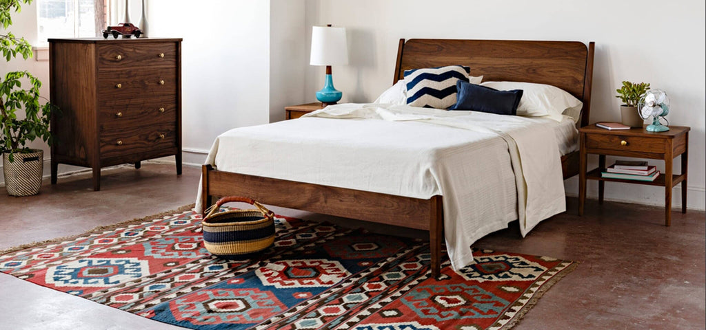
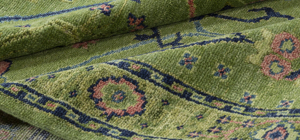
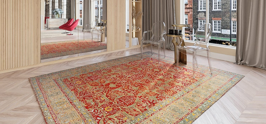
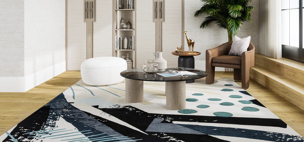
This beautiful warm design incorporates earthy neutrals with a magnificent green as the centerpiece.

If you lean more towards brighter hues, earthy olive greens with citron or even jade can make a more impactful statement. Warm neutrals will work exceptionally well.
'Warm neutrals have yellow, orange, or pink undertones, such as beige, tan, and gold.'
-Masterclass Home & Lifestyle
Nature-inspired elements are pushing ahead as a top designer choice as well. Open, light and airy spaces that incorporate sky and sea colors – grays and hues of blue – are a great way to bring the outdoors inside. Cool neutrals will be the perfect complement to this chill and sophisticated palette.
'Cool neutrals have blue, purple, or green undertones, such as gray, taupe, and ivory.'
– Masterclass Home & Lifestyle
Beige and Gray are not Either-Or
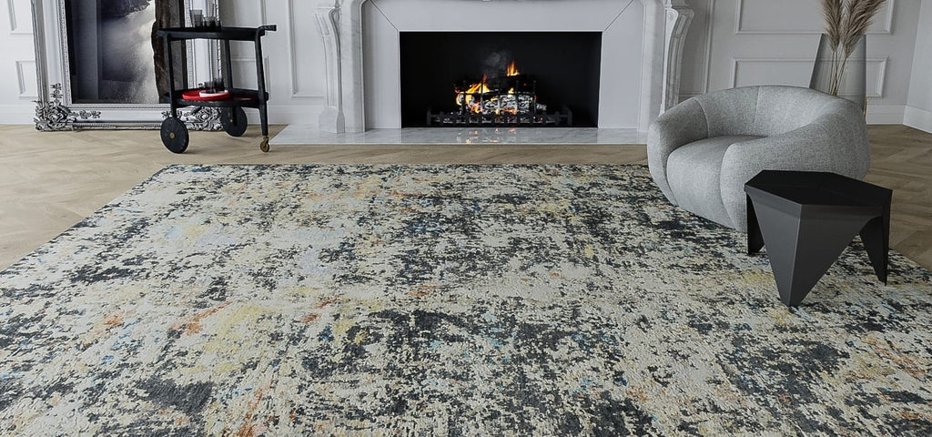
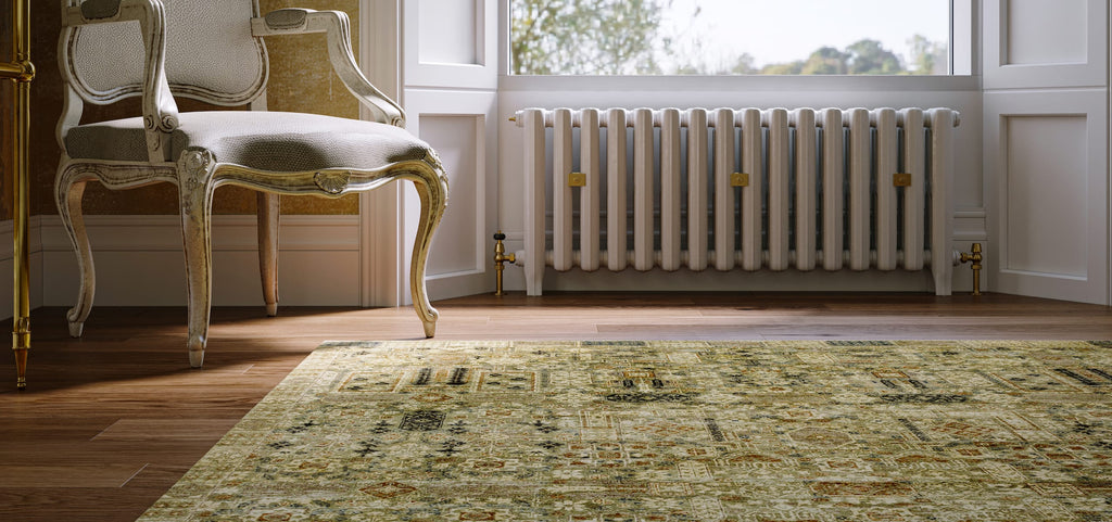
For 2022, flat cool grays are falling slightly behind the newer concept of warm grays, which some designers refer to as “greige.” Be open-minded to what’s out there and be inspired by some of the pieces that have already been created with this palette in mind.
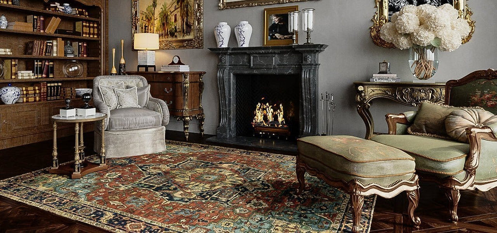
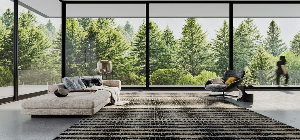
As seen below, this still very warm gray brings much warmth to this mostly cool-toned neutral space.

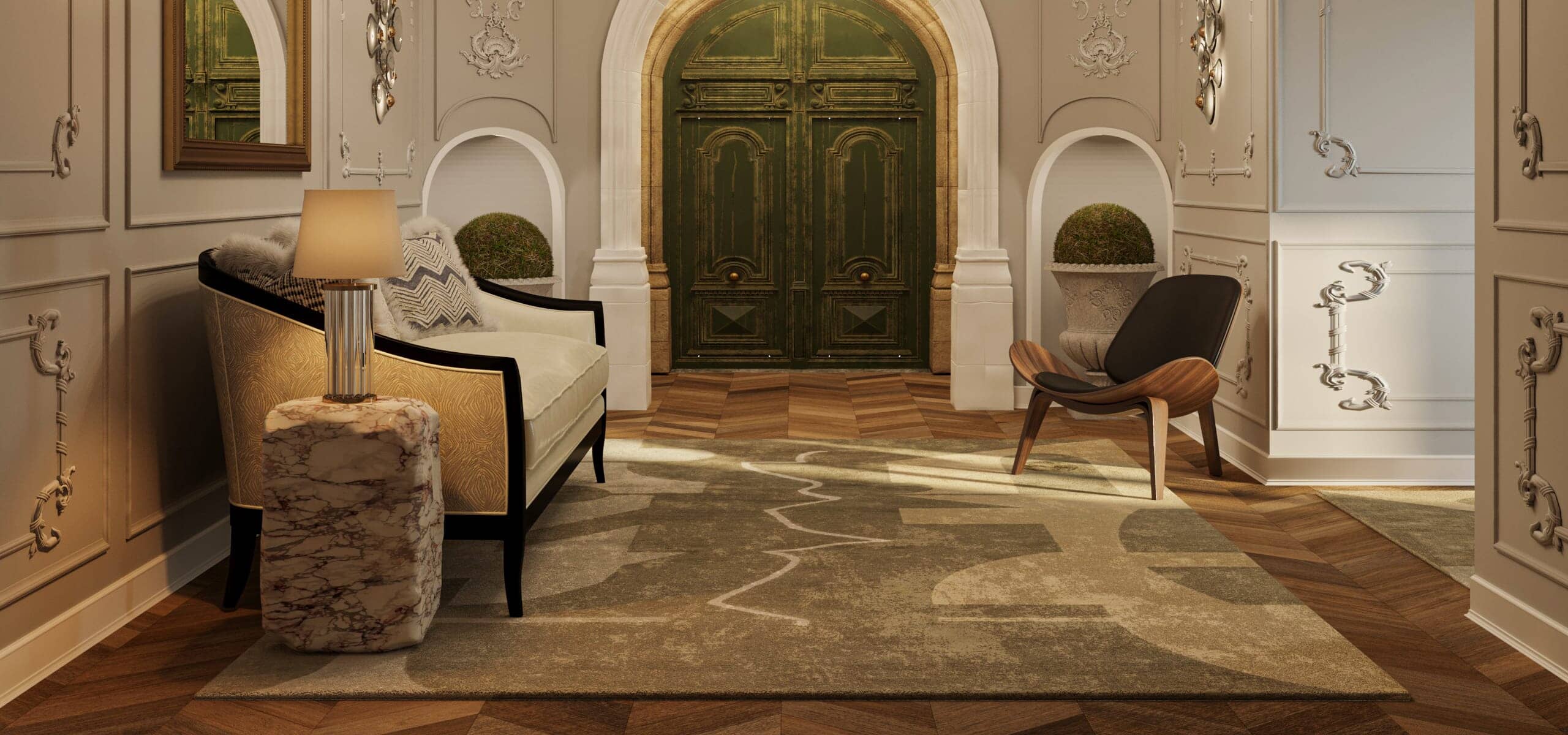
A beautiful example of greige is seen in the Tufenkian Moraine Grey rug.

How to Incorporate Neutrals into Your Room
Neutrals can be the central focus of a room - as is the case in a monochromatic palette – or they can offer a subtle and consistent backdrop for a bold accent color or a show stopping centerpiece item. Consider your overall room style, look and theme to help point you towards which neutrals will marry well in your space.

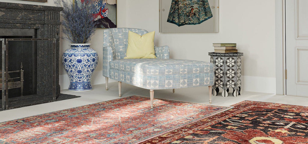
To instantly transform a room, add a handwoven neutral carpet and add a big impact to any room, invoking an immediate sense of cozy chic. Abacus Grey, seen above, is an ideal choice that adds interest to the floor without overpowering other design elements.

L-R: Shoreline Alabaster, Desert Smoke, Marcel Light Taupe
Adding a pattern in all-neutral colors adds more character and dimension, whilst still remaining soft and muted.

L-R: Delano Tan, Volos Stone Quarry
'A neutral carpet may have waves of beige, taupe, gray, and green hues swirling through them. One can introduce luxurious natural materials to make the decor around neutral rugs more dynamic, such as accents in green, parchment, straw, fennel or art, or iron elements accented with bronze.'
-Maggie Horne, Tufenkian Design Manager
How to Select the Right Neutral Rug
Chic and adaptable, a neutral hand knotted wool carpet serves as a perfect canvas to show off a prized painting, or an amazing view. Choosing a subtle color for your area rug allows you to experiment with texture, style and composition. Tibetan wool rugs in organic cream, beige, and white can add brightness to a room, while earthly blend-in tones can set the stage for unexpected design additions and accent colors. Try a deep palate of neutral walnut, navy or charcoal in a traditional rug to add dimension without distraction.
When one thinks of how interior designers are masters of color we start with bright, bold hues—magentas, emeralds, cyans, and other trending, electric colors that together craft the fodder of shelter magazines. Yet great design is also about the minuscule differences in shade and tone easily missed by an untrained eye, and they bring this color finesse to neutral area rugs as often as those that are brilliantly colored.
For example a kitchen with neutral rugs is a soothing environment to spend time in, and neutral area rugs make the food and people in the space look glamorous. What could be more neutral than a neutral carpet in a Swiss Chalet?
A neutral carpet may have waves of beige, taupe, gray, and green hues swirling through them. One can introduce luxurious natural materials to make the decor around neutral rugs more dynamic - such as accents in green, parchment, straw, fennel - or art or iron elements accented with bronze.
For neutral rugs to be successful, they need depth and complexity. Picking everything in a matchy-matchy strategy will underwhelm, so watch out! It is important to remember that the point of decorating with neutral area rugs is to bring in as much texture as possible. Use a variety of fibers, varying pile heights, or a combination of both to generate interest and layers, just as you would incorporate salt, sour and sweet flavors when preparing delicious foods.